TL;DR
Led the creation of Revvity's first unified design system, reducing design iteration time by 25% and handoff errors by 30% across 3 enterprise products in the life sciences industry.
25%
Faster Design
Iteration time
30%
Fewer Errors
Dev handoff
WCAG AA
Accessibility
Compliant
1My Role & Context
My Responsibilities
Design system architecture, component design, documentation, stakeholder alignment, and adoption strategy
Scope
3 Enterprise Products: Signals BioDesign, Signals Notebook, Signals Inventa
Company
Revvity (formerly PerkinElmer)
2The Challenge
"Building a design system is easy. Getting people to use it is the hard part."
Creating a design system for enterprise software is uniquely challenging because you're not just designing components—you're changing how teams work:
- Stage 1: Proposing the Initiative — Convincing leadership to fund a design system when the value hasn't been proven yet. "Why spend resources on this when we could ship features?"
- Stage 2: Creating Components — Building abstract, reusable components that work across vastly different products with different codebases and frameworks.
- Stage 3: Team Adoption — Getting established design teams to change their workflows and adopt new processes they didn't ask for.
- Stage 4: Continuous Contribution — Ensuring teams contribute back to the system instead of creating one-off solutions.
3UX Design Principles
I established four core principles specifically for designing software in the life sciences industry:
Customers First
We build products that create value for our customers. We partner with them to understand and solve their challenges—not blindly follow the solutions they present to us.
Facts Over Opinions
We defer to facts over opinions, using evidence and research-based design philosophy. This allows us to challenge everything and favor present reality over past assumptions. If unsure—ask!
Always a Work in Progress
Our focus is on learning, iteration, and continuous improvement. We are agile, always learning, and open to change. There are always ways to solve problems in easier, simpler, more intuitive ways.
Usable by Everyone
User experience connects humans to products through empathy and understanding. We are inherently inclusive and strive to create solutions for everyone—always advocating for WCAG AA accessibility compliance.
4Design System Architecture
I structured the design system with scalable foundations that support growth:
🎨
Style Guide & Tokens: Colors, Copywriting, Iconography, Spacing, and Typography ship as ready-to-use foundations, with Dark Mode in progress. Components covers 33 production-ready UI primitives, each with Introduction, Usage, Variants, and UnifyUI specs. UX & UI Foundations codify cross-product patterns — auth flows, forms, autosave, error handling, localization, AI chat, system feedback. Bench Workflows capture life-sciences-specific flows (data analysis, protocols, running samples) that no off-the-shelf system covers. Every page carries a ✅ Ready / 🟡 In Progress badge so consumers know what's safe to build on today.
Design Decision
Evolve existing patterns rather than rebuild from scratch
Three products had diverged into incompatible design languages over years. A full redesign would break existing user muscle memory and require massive dev effort. I chose an incremental unification strategy: establish shared tokens and primitives first, then gradually converge components — cutting iteration time by 25% while maintaining continuity for existing users.
5Design System Showcase
Complete design system documentation — from UX principles to component library:
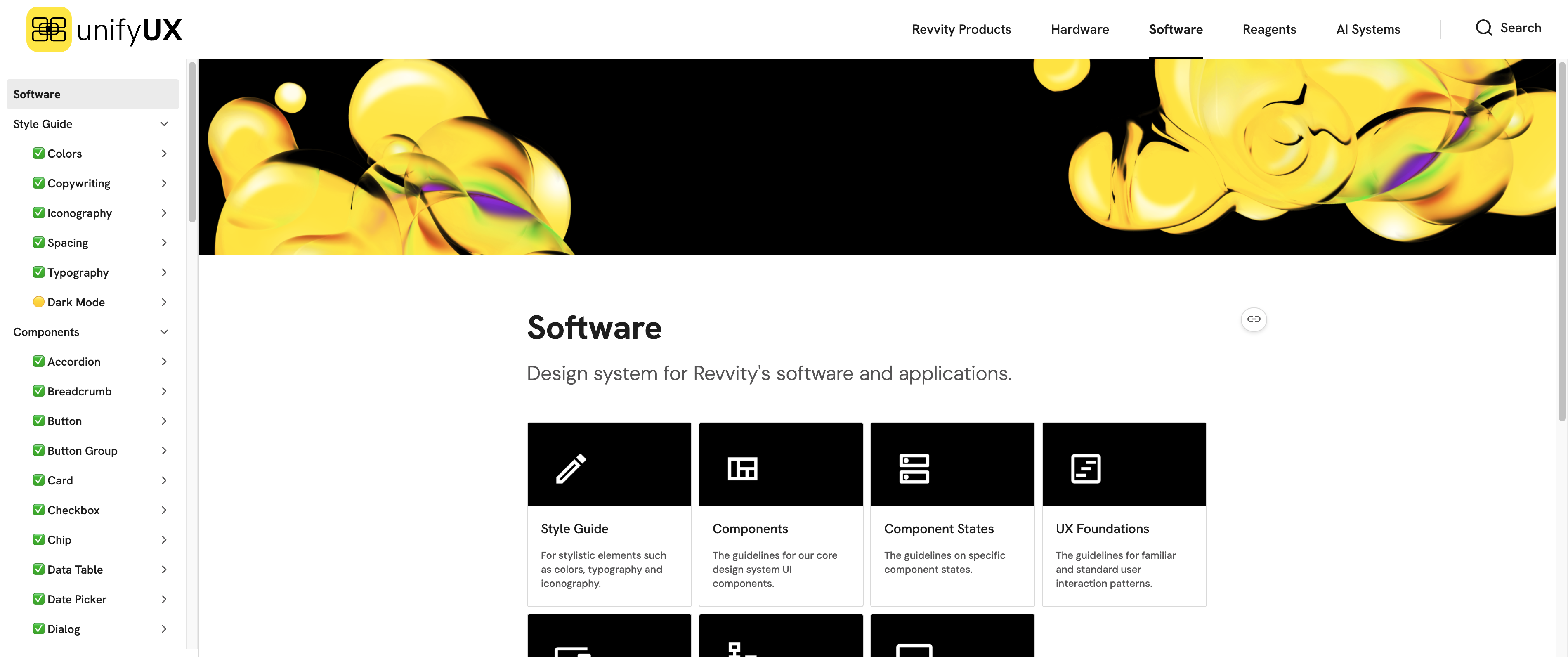
Software hub — the UnifyUX design system covering Style Guide, Components, Component States, UX & UI Foundations, Bench Workflows, and Desktop Platform
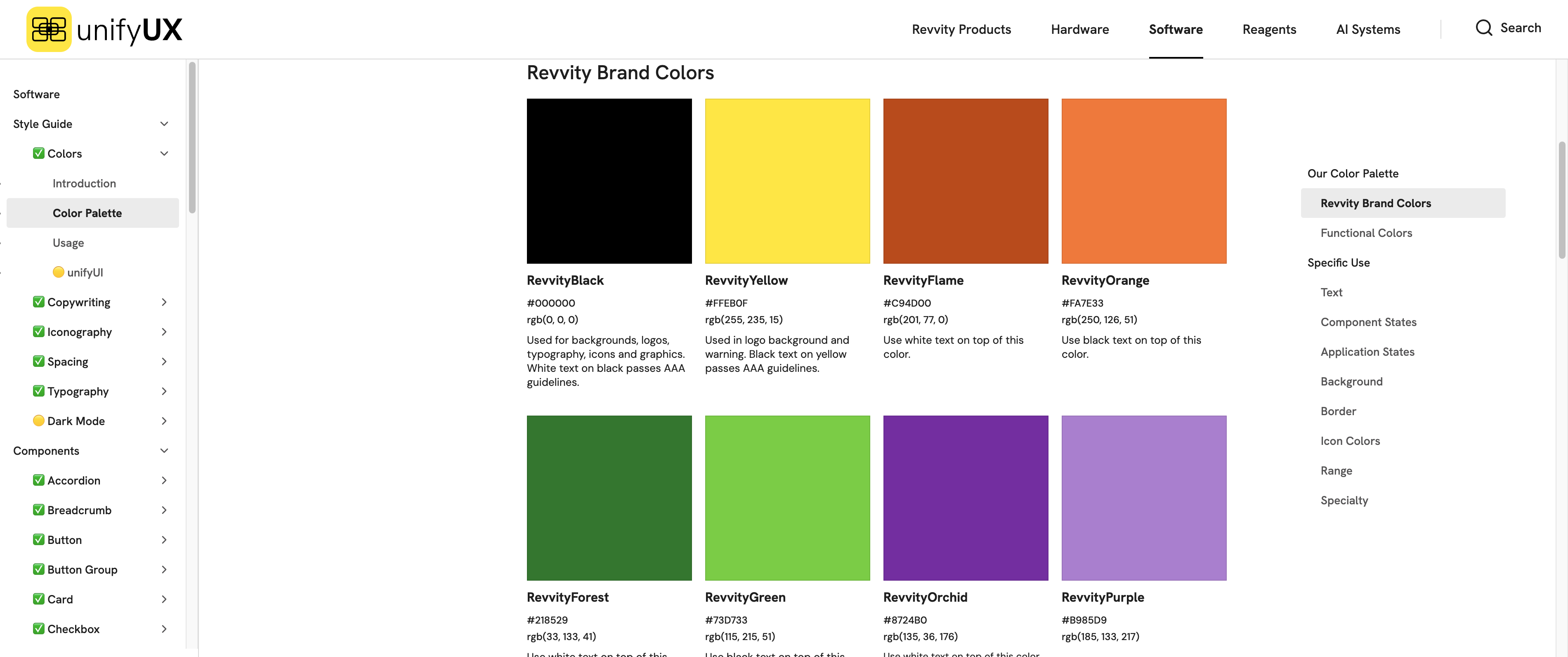
Color Palette — 13 named brand colors (RevvityBlack, RevvityYellow, Flame, Orange, Forest, Green, Orchid, Purple…) with AA-compliant pairings
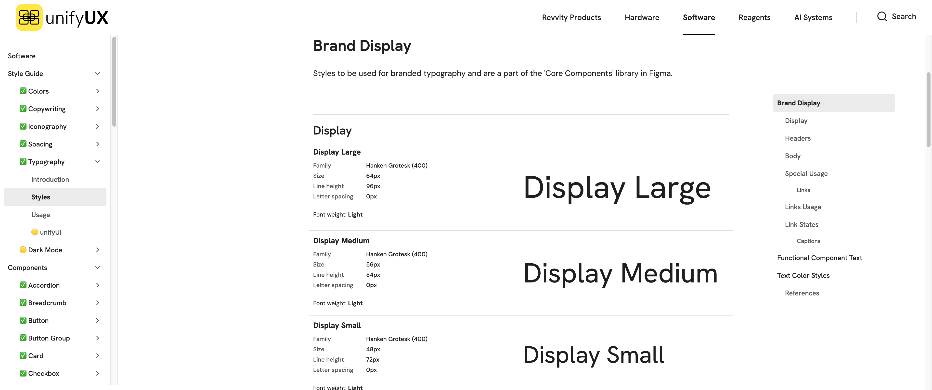
Typography — Hanken Grotesk Display Large 64 / Medium 56 / Small 48 px for brand, native system stacks for functional UI text
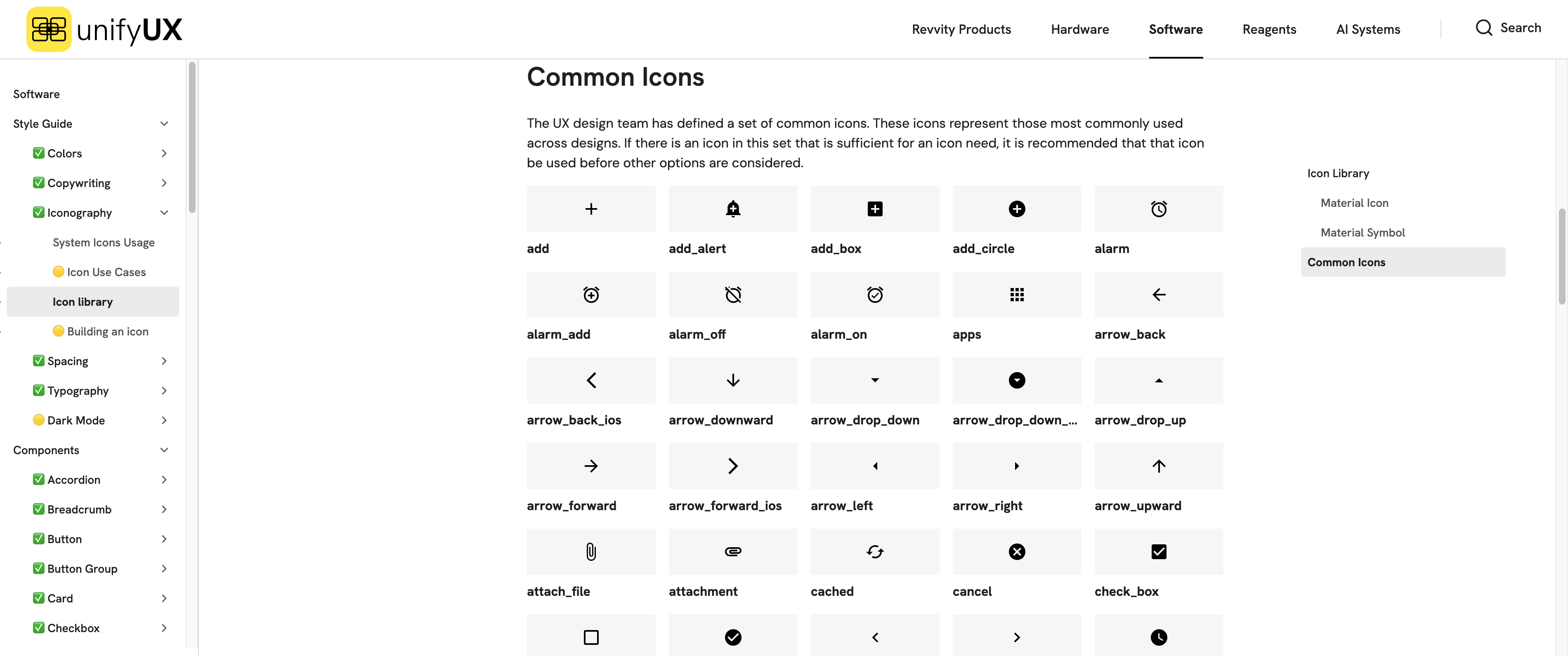
Iconography — Material Symbols-based common icon set with labeled-icon usage rules grounded in ISO 11581-10
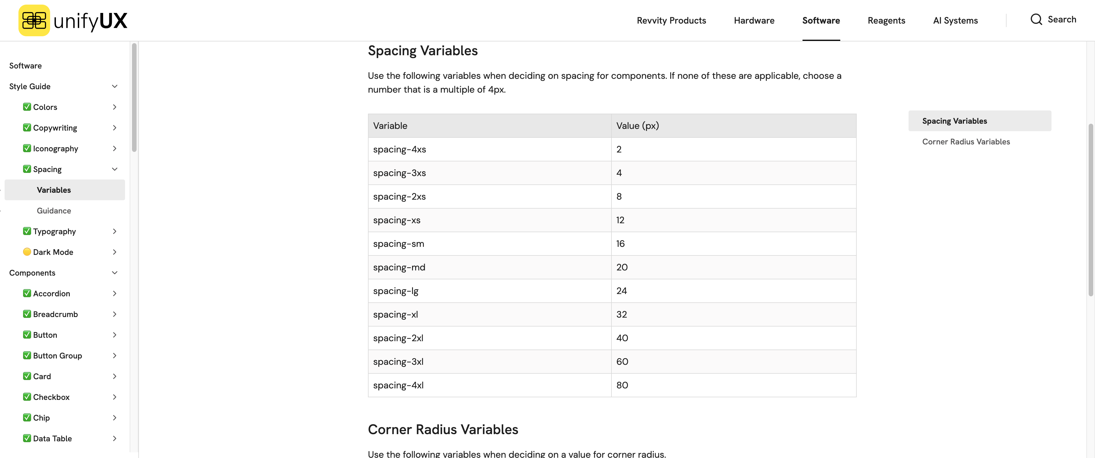
Spacing tokens — 11 named variables on a 4 px base (spacing-4xs 2 → spacing-4xl 80) shared between Figma and code
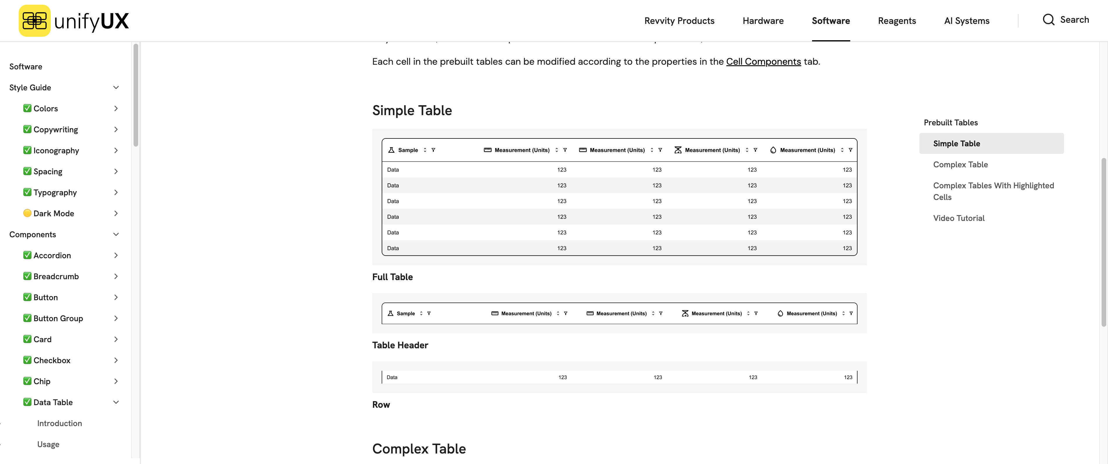
Components — 33 production-ready UI primitives such as the Data Table prebuilt set, each with Introduction, Usage, Variants, and UnifyUI specs
6Key Deliverables
Color System
13 named brand colors anchored on RevvityBlack and RevvityYellow, layered with functional groups for Text, Component States, Application States, Background, Border, Icon, Range, and Specialty. WCAG AA contrast and ISO 9241-125 compliance baked into every pairing.
Typography
Hanken Grotesk for brand display (Large 64 / Medium 56 / Small 48 px), paired with native system stacks — San Francisco, Segoe UI, Roboto, Ubuntu — for functional UI text. Progressive enhancement keeps performance and OS-native feel intact.
33 Production Components
Button, Data Table, Date Picker, Dialog, Dropdown, Navigation, Stepper, Toast, Tooltip and 24 more — each with Introduction, Usage, Variants, and UnifyUI tabs. Every page is tagged ✅ Ready or 🟡 In Progress so teams know what's safe to build on.
Spacing & Radius Tokens
11 spacing variables (spacing-4xs 2 px → spacing-4xl 80 px, all on a 4 px base) and 8 corner-radius variables (radius-2xs 2 → radius-2xl 24, plus radius-round). Same token names ship in Figma and code — eliminating "what px is this gap" pings during handoff.
Navigation & Iconography
Research-backed navigation patterns and a labeled-icon system. User testing showed labeled icons beat icon-only on both response time and satisfaction — so every icon ships with a label rule grounded in ISO 11581-10 and Jakob's Law.
💭 What I Learned
Design systems aren't about components—they're about changing organizational culture. The hardest part wasn't building the system; it was building trust. I learned that adoption happens when you solve real pain points, not when you have the prettiest documentation. The teams that adopted UnifyUX fastest were the ones I paired with early, understanding their specific challenges and designing solutions together. A design system is a product, and its users are your fellow designers and developers.
